In data visualization, a plot refers to a graphical representation of data. It is a visual display of data that allows us to easily identify patterns, relationships, and trends in the data.
Plots can take many forms, such as scatter plots, line graphs, bar charts, histograms, and more. The choice of plot type depends on the type of data being visualized and the type of insights that we want to extract from it. For example, a scatter plot might be used to show the relationship between two variables, while a histogram might be used to show the distribution of a single variable.
The use of plots is an important tool in data analysis and data communication because it allows us to present complex information in a way that is easy to understand and interpret. A well-designed plot can help us to identify outliers, trends, and patterns that may not be immediately apparent from raw data.
In the R program, the plot() function is used for plotting. It can be customizable in a variety of ways to produce more impressive styles of graphs. some of the arguments that are reasonable for the designs and styles in plot function are:
- Shape of the data point - pch
- Size of the plot - cex
- Colour of the plot - colors()
- Connectivity between the points - type
- line type and width - lty and lwd
Let's see the examples with R-code.
Generating datasets a and b, and visualising the graph with the standard plot() syntax:
a = 1:10
b = runif(10,5,15)plot(a,b)
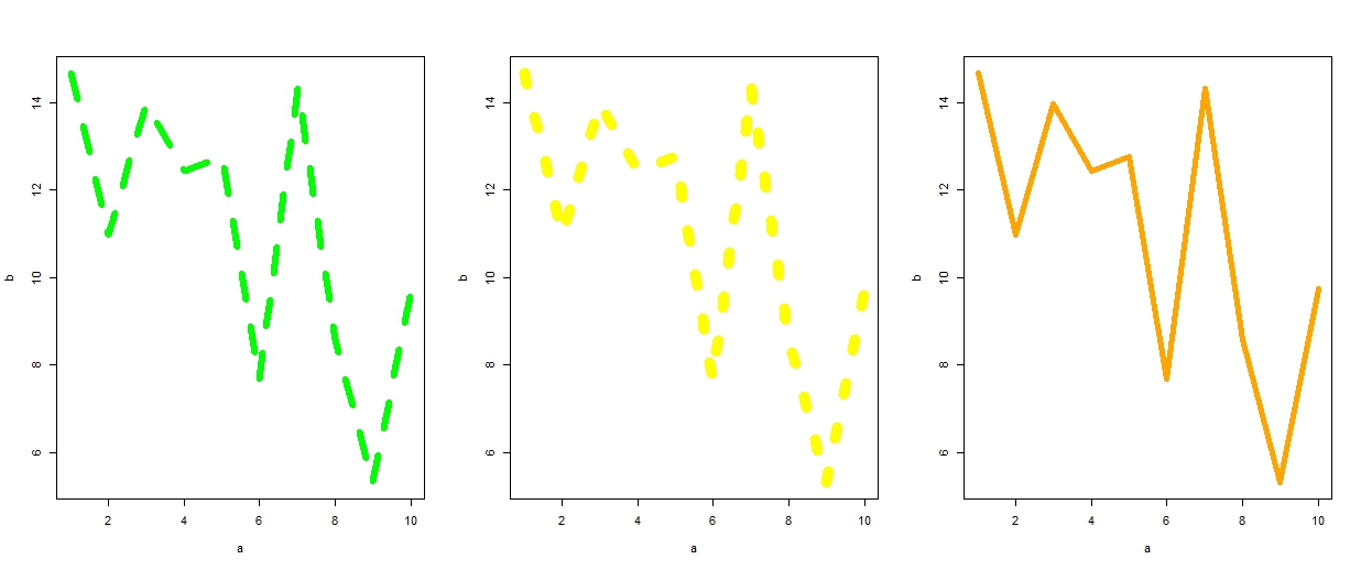
par(mfrow = c(1,3))
plot(a,b, type = 'l',col = "green", lwd = 6, lty = 2)
plot(a,b, type = 'l',col = "yellow", lwd = 10,lty=3)
plot(a,b, type = 'l',col = "orange", lwd = 5, lty=7)
 The line types and widths with different colours of the data points are increasing which is clearly illustrated in the sequence shown above.
par(mfrow = c(1,2))
plot(a,b, type = 'p',col = "blue",pch=11, cex=.5)
plot(a,b, type = 'p',col = "red",pch=23, cex=2)
plot(a,b, type = 'p',col = c("red", "violet","black"),pch=c(14,15,16), cex=2)
We can define a heading for the plot with a "main" argument. Then x-axis and y-axis are also defined by using "xlab and "ylab" arguments in plot() syntax.
plot(a,b, type = 'p',col = "red",pch=23, cex=2, main = "Example plot", xlab = "x-axis", ylab = "y-axis")
par(mfrow = c(2,3))
plot(a,b, type = 'b',col = "violet",pch=23, cex=2, main = "Type - b")
plot(a,b, type = 'h',col = "black",pch=23, cex=2, main = "Type - h")
plot(a,b, type = 's',col = "brown",pch=23, cex=2, main = "Type - s")
plot(a,b, type = 'p',col = "red",pch=23, cex=2, main = "Type - p")
plot(a,b, type = 'c',col = "green",pch=23, cex=2, main = "Type - c")
plot(a,b, type = 'o',col = "green",pch=23, cex=2, main = "Type - o")


